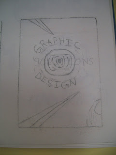
In the future I would probably incorporate more geometric shapes to see if it adds anything to my poster.
The font that I used was created by Herbert Bayer, who came up with a mostly lowercase, san serif font, that was to be used for all Bauhaus printing. The font's simple lines and graceful curves further reflected the intended modernism of the Bauhaus. I also decided to use the red and black colors from the Joost Schmidt poster with a neutral background. However, instead of using an orange-red color I decided to use a darker red.
For my comp. I was inconsistent with my spacing throughout the poster, which disrupted the flow.
I decided to research the Bauhaus movement and picked the designer, Herbert Bayer, from that movement. I discovered that the Bauhaus movement was very structured, cleaned lined, and geometric. One of their posters, designed in 1923 by Joost Schmidt, had tilted rectangular and circular shapes. I wanted to incorporate all of these design elements into my poster.


